5 Simple Ways to Elevate Your Squarespace Website Design

Squarespace is our go-to website platform for our clients. In fact, we wrote a whole blog post about how much we love it and why we use it, but to summarize:
It’s an all-in-one platform with no third-party plugins or add-ons required.
It’s intuitive to use.
It’s totally secure.
It’s low-maintenance – no manual updates required (looking at you, WordPress!).
It’s budget-friendly, with plans starting as low as $12 per month.
It offers 24/7 customer support.
Squarespace HQ has been hard at work releasing more customization options to help users level up their websites. Designs that were previously only achievable through custom code are now baked into the platform. DIY-ers rejoice!
Today, we’re going to share five simple ways to get that designer look for your Squarespace website without code.
*Note: these features are only available on Squarespace 7.1 with the Fluid Engine builder enabled.
5 No-Code Design Tricks to Level Up Your Squarespace Website
1. Utilize the new button styling options.
Over here at Hoffbeck + Co, we LOVE a good call-to-action button that really pops. Squarespace now has unlimited options for customizing your buttons to fit the vibe of your website.
Here’s what you can play around with to make your buttons more unique:
Shape. You can choose between a square, rounded rectangle, pill, circle, underline, or petal, or customize the corners yourself to create a unique shape.

2. Fill or no-fill. You can choose to have your buttons filled in OR outlined with no fill.

3. Padding. Padding refers to the free space around the button text. Squarespace allows you to customize the padding on the top, bottom, and sides of the text.

4. Text options. You can choose from hundreds of different fonts for your buttons. You can also change the space between letters, the size of your button text, and whether you want the text to be uppercase, lowercase, or sentence case.

You can play around with all these options by clicking the paintbrush icon in the top right corner of your Squarespace site’s backend and then clicking on the buttons tab.
2. Have fun with text highlighting.
Text highlighting is a super fun new feature that allows you to add color and designs to make words on your website stand out.
Here’s an example.

Cool, right?
I once spent at least an hour and dozens of lines of code to achieve this exact look on a client’s site two years ago. Now, you can get it with just a couple of clicks!
Here’s how:
Add a text block in Squarespace like you normally would.
Type something in that text block, and then highlight a word or phrase.
Click on the icon in the toolbar that looks like an A with scribbles underneath.
Play around with your options in the little window that pops up!
You can choose from twelve different options:
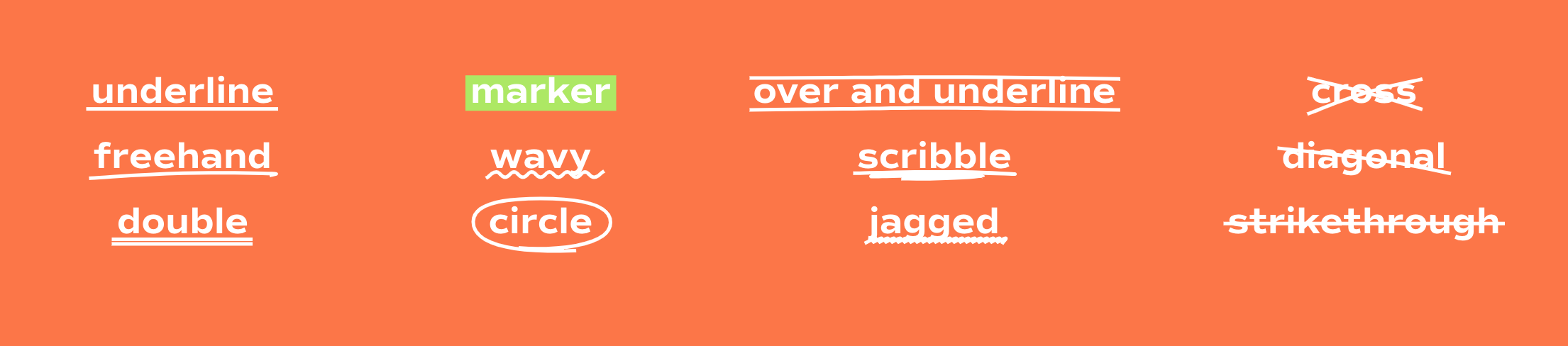
You can also choose the color for your text highlight, control the thickness, and even add animation.
3. Add a scrolling marquee.
Add more movement and elevate your website with a scrolling marquee! This is another one that used to take quite a bit of custom code to accomplish, but now it’s a simple add with a lot of impact! Check out our client Gloo Consulting’s website to see it in action.

Here’s how:
In the Squarespace editor, click to add a new block and choose “Scrolling”.
Add your text. You can add multiple text items and symbols.
Switch over to the design tab in the flyout box.
Choose your wave intensity, text style, size, direction, speed, and item spacing.
You can also add a background, choose a color for it, and tweak the corner rounding and padding.
This scrolling marquee is perfect for your brand’s tagline, value propositions, or even headlines!
4. Add section dividers.
One of my favorite features Squarespace has rolled out recently? Section dividers!

Here’s how:
Choose the section you want to add a divider to and click “edit section” in the Squarespace editor.
Scroll down to the “Styling” section in the flyout box and toggle on “Divider”.
Choose from 8 different shape options.
Play around with the width toggle, height settings, and alignment.
You can also add a stroke/border and choose a color and thickness.
My favorite places to add section dividers are below the header section at the top of the page, and above the footer section at the bottom.
5. Get creative with the shape block.
See this cute overlapping look?

Yeah, this used to take a few lines of code or a workaround in Canva to achieve.
With Squarespace’s new shape block, you can get this look in seconds.
Here’s what you’ll do:
Add an image block to a section in the Squarespace Fluid Engine editor.
Click to add another block and scroll down to “Shape”.
You’ll see a new box in your section. Click on it and click the pen icon.
In the flyout box, you’ll be able to choose from several different shape options.
You can also edit the rounding of the corners, change the color, add a border, or add a drop shadow.
Exit out of the flyout box, click on the shape again, and click the “Move Backward” icon (or Shift + ↓) to move the shape behind your image.
Be sure to check out the mobile version of your site and make sure everything looks good! If not, you can move the elements around in the mobile editor until it looks perfect.
The shape block is super versatile. You can also use it to create a “layered” look between sections, like the example below.

All you need to do is:
Make sure the section with the element you want to overlap has “Fill Screen” toggled OFF in the section settings.
Add a shape block and make it the same color as the section above.
Move the shape block to the top of the section and then use the “Move Backward” icon (or Shift + ↓) to place it underneath the other elements.
There you go! It looks like you added some fancy code to make this happen. Work smarter, not harder! ;)
A Designer Look on a DIY Budget
Is your Squarespace website due for a little upgrade? Take advantage of some of these new features to really make your site pop 💥
And if you’re ready to say bye to DIY and bring in the big guns for your website, ask us about our custom website packages. There’s a LOT more we can do with some custom code and a professional touch.

More soon,
Mara
WEB DESIGNER + SEO SPECIALIST
P.S.
Subscribe to get our weekly blog with marketing, business, and finance tips dropped straight into your inbox.


