Do’s and Don’ts for Your Website Navigation Bar

A couple of weeks ago we did a deep dive on the last thing you see on a website: the footer.
Today, we’re talking about one of the first things you see on a website: the top navigation bar.
The deal is, your site’s navigation bar can make or break your user experience. It’s literally a map to guide users to the information they’re looking for, so you want to make sure you aren’t unintentionally getting in their way (and potentially losing sales because of it).
Read on for what to include in your website navigation bar – and more importantly, what to leave out!
The Essential Do’s and Don’ts for Your Website Navigation Bar
1. DO keep your menu simple.
For most businesses, you really only want to have five or six menu items in your navigation bar.
GASP! Hear me out. I know you want to make it as easy as possible for people to find the content they’re looking for on your site. But have you ever heard of analysis paralysis?
It’s when you’re presented with too many options at once, so you struggle to choose one. We’ve all seen websites with wayyyy too many menu items, and each one has a dropdown with more items underneath. Cue analysis paralysis.
Try your best to pare down your menu items to six or fewer. Any other pages you’d like to feature on your website can go in your footer. I know, I know – the footer?! The thing is, people know to go to your footer to find a full list of pages and additional navigation options.
Now, before you totally freak out… just like almost everything in life, there are exceptions to the rule. We fully realize that there’s a time and place to have dropdowns in your top navigation, and sometimes it’s appropriate to create a more robust “mega menu” for certain websites, like a university or other large or more complex organization. YET, even if these situations apply, the principle here still remains: keep it clear and keep it simple.
Pro Tip: You don’t need to add “Home” as a menu item. The majority of website users know that they can click on your logo to navigate back to your home page, so don’t waste that valuable real estate in your nav bar!
2. DON’T overload it with clutter.
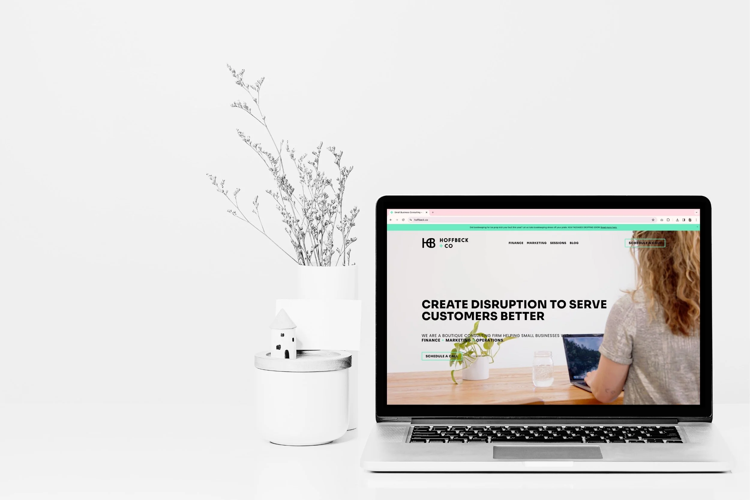
Here’s what should be in your website navigation bar:
Your logo
Six or fewer menu items
A strong, direct call-to-action button
You can maaaaybeeee add your phone number in the top right corner if it makes sense for your business (think: a plumber where customers need help ASAP), but most businesses should leave that off.
This isn’t the place to put your address, either – put that in your footer instead. People know to go there to find that information.
3. DO try to follow the “Z pattern” layout.
When we land on a website, our eyes naturally and subconsciously follow a “Z pattern” to take in the information we see. We start in the top left corner, then scan across to the top right, then across the page, and then along the bottom – just like the letter Z!
(For a visual of this, check out this Instagram video from Mahla!)
Generally, users expect to see your logo in the top left corner, the navigation menu links in the top middle, and then a call-to-action button in the top right corner.
This doesn’t mean there’s no room for creatively mixing this up. If you want to try something different and put your logo in the middle, for example, go for it! Play around with the design, but keep it simple and make sure you maximize the prime real estate in your header section using the Z-pattern.
*Remember, doing something different and creative that ends up confusing people will have the opposite effect that you’re hoping for! Clarity and simplicity win every time. People need to easily and quickly know where to go and what to do on your website.
4. DON’T add your social media icons/links.
People, don’t add your social media icons and links to your navigation bar.
Why? Because you want your customers to stay on your website!
You want them to browse around, learn more about what you’re offering, and take the next step to working with you. They can’t really do that if they’re jumping right to your Instagram page as soon as they land on your website.
Plus, this can be detrimental to your website’s SEO. Bounce rate refers to the time users spend on your site before “bouncing” (or clicking away from your site), and it’s a key metric in how well your site ranks on Google.
The footer is a great place for your social media links if a user wants to follow along with your brand or learn more about you after they’ve spent some time on your website.
*Pro Tip: If you have awesome Instagram or TikTok content, design a cool social media section on your home page (further down the page a section or two above the footer) and make the section headline something like: Follow us @insertyourIGhandle and hyperlink the handle to your social page. This allows you to feature the great content you’re investing so much time and effort into on your website, while also encouraging people to follow, without pulling them away from your website immediately upon their arrival.
5. DO use a strong, direct call-to-action (CTA) button.
The importance of having a clear button in the top right corner of your navigation to invite customers to take the next step with your business cannot be overemphasized. This is essential. There is a reason why nearly every major business’s website has a bold, clear CTA button – because it works!
When a customer is ready to buy, you don’t want them to hesitate even in the slightest or be confused trying to figure out what to do next. You want to make it so clear and obvious that they don’t even have to think about it, they just click it and do the next thing. Use a bold, prominent button with clear, punchy action-oriented words.
Here are a few quick tips:
Think about the one next thing you want a customer to do on your website. Do you want them to buy something? Schedule a call with you? Book an appointment?
Use clear and direct language like Buy Now or Book a Session. Keep it short and to the point. Avoid trying to get overly creative with the words. That usually ends up adding unnecessary hesitation and confusion.
Make sure you use a bold, stand-out color to make your button really pop.
6. DON’T make your logo bigger.
Okay, this one is kind of just for fun. It’s a running joke amongst web designers that clients always ask, “Can you make the logo bigger?”
We laugh, but seriously… don’t make your logo bigger (unless it’s literally illegible or unclear, of course). If your logo is in your top navigation bar, people will see it.
Is your navigation bar helping or hurting your customers’ experience on your website? See if you can implement a few of these tips to clean it up a bit.
Feeling inspired to learn more about website design and strategy? Dig into some of our other blogs about improving your website! 👇🏼
As always, if you need help whipping your website into shape, we got you! Schedule a Call to talk to us about what we can do to help.

More soon,
Mara
WEB DESIGNER + SEO SPECIALIST
P.S.
Subscribe to get our weekly blog with marketing, business, and finance tips dropped straight into your inbox.

