How to Use Color Theory to Choose Your Brand Colors

A distinct color palette is a key part of your brand’s identity.
If you need some convincing, color influences 85% of consumers’ purchasing decisions.
Psychologists have long studied the effects of color on human emotions and behavior, as color has the power to move us and make us feel a certain way. It can evoke emotion, convey messages, and build strong associations. For all of these reasons, it’s an important tool to understand so that you can leverage it in a meaningful way to set the mood and tone of your brand.
When choosing and implementing colors, there are a few main concepts to consider.
In this post, we’ll cover color theory, some common lingo, color psychology, and resources to help you build a color palette for your own brand.
The Basics of Color Theory
You likely learned about the Color Wheel in school as a kid, but here’s a refresher if you can’t quite remember. Understanding these basics can help in pairing colors that will work well together in your brand.
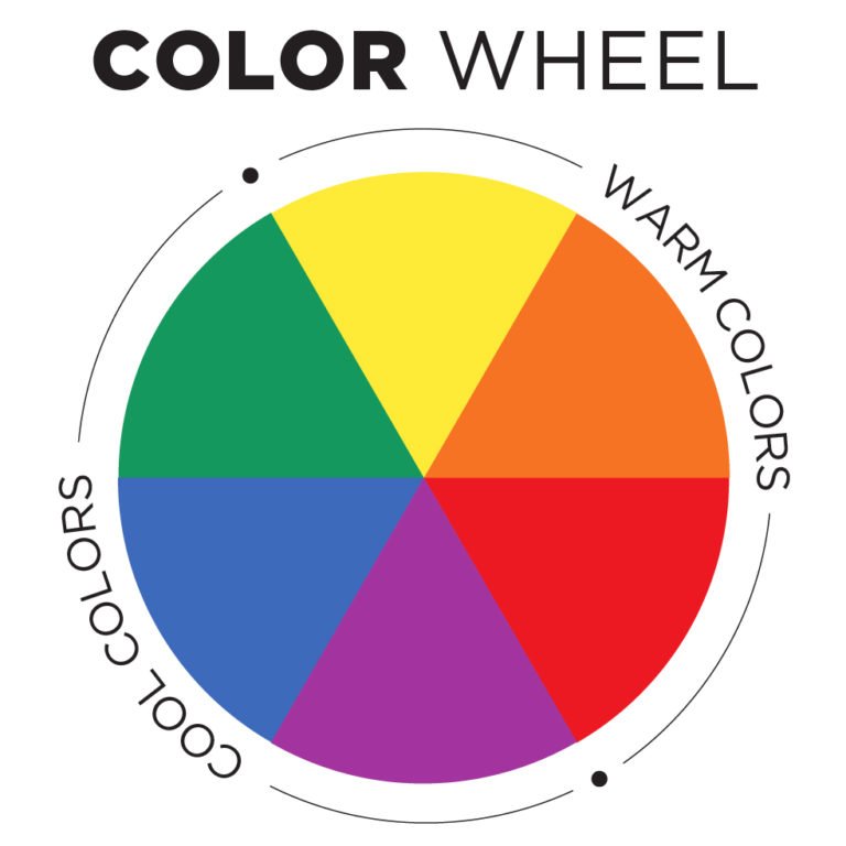
The color wheel dates back to Isaac Newton, who first organized color in a circle after noticing the way white light reflected a spectrum of color off of the prisms he was studying.

It is made up of the three primary colors (red, yellow, and blue) evenly spaced around the circle with the secondary and tertiary colors they create between them.
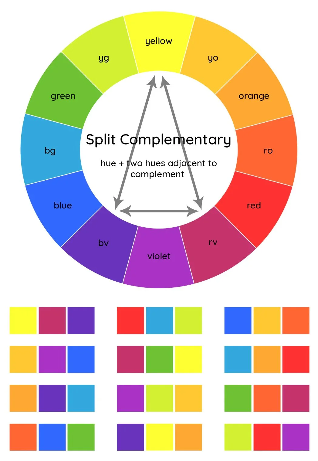
Colors that are directly across from each other on the color wheel are called complementary colors. These are considered contrasting opposites that create vibrant designs that pop. You can tone down a complementary color scheme and add in a third color by creating what’s known as a split complementary color palette. This is when you replace one of the complementary colors with the two colors on either side of it. So, for example, if creating a palette based on red and green, a split complementary color combination could include red, yellow-green, and blue-green.
Colors next to each other on the color wheel are called analogous colors. They are commonly found in nature and are used together to create a more soothing, unified effect. A great example is green, yellow-green, and yellow.
Another way to create a harmonious color combination using the color wheel is to choose three colors equidistant from each other. This is called triadic colors and works best when one color is dominant and the other two are used as accents.

Common Lingo to Know
Any of these harmonious color schemes can be expanded upon by considering the tints, shades, and tones of the main hues.
Here’s how those concepts are defined:
Hue: origin of the color we see, typically one of the six primary or secondary colors
Tints: hue + white
Shades: hue + black
Tones: hue + gray (This is one way to create a muted color.)

Using tints, shades, and tones in your color palette can help create contrast, legibility, and an overall more mature look and feel. You can even create a monochromatic color palette by using different tints, shades, and tones of just one hue.
Examples of the use of monochromatic colors:
Here’s some other lingo that’s good to know when talking about color:
Muted vs. Saturated Colors
Saturated colors are vivid and intense. They are at their purest form, with strong pigmentation. Examples include bright reds, deep blues, and vivid yellows — colors that are attention-grabbing and often associated with energy, excitement, and vibrancy. Muted colors are created by adding gray or the complementary color to a pure hue, resulting in a subdued appearance that evokes feelings of calmness, subtlety, and sophistication.


Warm vs. Cool Colors
Colors can also be divided by their perceived temperature associations, which you probably understand intuitively. Warm colors are yellows, reds, oranges, and browns and tend to appear to come forward in a design, creating a sense of dynamism and attracting attention. Cool colors are blues, purples, greens, and grays and evoke a feeling of calmness and stability. They appear to recede or move away from the viewer, creating a sense of depth and space in a design.
Color Value
Value refers to the lightness or darkness of a color. It can be easily understood if you consider what it would look like if your color palette was converted to black and white. Having a variety of values within your brand’s color palette is important for creating hierarchy and readability in your materials.

The Psychology of Color
How do you want people to feel when they interact with your brand?
Color plays a strong role in buyer behavior. Over the years, as colors have been used and studied, strong associations have emerged based on culture and human psychology. These associations are deeply ingrained in our subconscious minds and can affect the way your brand is interpreted.
Below are some examples of how colors are perceived in the Western world. Keep in mind that color can have drastically different associations in other cultures and that the meaning of a color can change based on its saturation, tint, shade or tone. Associations can also change based on the specific context in which a color is paired with other colors.
🌈 Did you know that in Japan, the sun is often drawn as red? And yellow is associated with death and mourning in Egypt?
Red
Power, passion, love, danger, energy
Suggested use: Use to draw attention and encourage immediate action
Orange
Joy, enthusiasm, change, movement, vitality, creativity
Suggested use: Use in tandem with positive messaging and as a more inviting call to action
Yellow
Happiness, optimism, intellect, warmth, cowardice
Suggested use: Use sparingly as an accent color – too much can cause anxiety!
Green
Nature, growth, new beginnings, wealth, jealousy
Suggested use: Use to evoke a sense of your brand being on the rise.
Blue
Tranquility, confidence, stability, trust, sadness
Suggested use: Use as a background to create depth and an overall feeling of calmness.
Purple
Luxury, royalty, imagination, mystery, soothing in lighter tints
Suggested use: Use deliberately and sparingly to create a feeling of exclusivity.
Fun fact: Purple has long been associated with royalty because it was historically a very hard and expensive pigment to create.
Black
Power, sophistication, edgy-ness, mystery, mourning
Suggested use: Black is best used in high-contrast situations, so pair it with a lighter hue or tint.
White
Peace, innocence, simplicity, cleanliness, sterility, spirituality
Suggested use: Use as type or accent with a high-contrast background for a bold look and feel or use as the background with pops of color for a clean, approachable design.
Creating a Color Palette for Your Brand
A brand color palette is an essential part of your brand’s style guide (for more on what a brand style guide is and what elements are included, check out our post here).
When picking out your brand’s colors, it’s important to consider the context in which they are being used, the feeling you want your brand to evoke, and the practical aspects of contrast and legibility in your designs.
A good place to start is by choosing three primary colors and defining them as dominant, secondary, and accent colors. You can then use the 60-30-10 rule as a guideline for how you use these colors to create balance, visual interest, and hierarchy. Following this rule, a design should include:
60% Dominant Color to set the tone and acts as the primary visual element of the design, often used as the background color.
30% Secondary Color to add visual interest and depth to the design, often used for larger elements.
10% Accent Color used sparingly and strategically to draw attention to specific elements or details, often used on buttons or text callouts to create focal points or add pops of color.
As is true with all elements of your brand, consistency is key. As viewers see your brand’s colors used together over and over, they will start to associate that color grouping with your organization, creating brand recognition — yay!
Resources
There are lots of online resources to help you pick colors or find inspiration for color palettes. Here are a few to get you started:
🎨 Color can have a big impact, but is still just one element of your brand. Schedule a Free Call, and we’ll help you hone in on your organization’s look and feel with our branding and marketing services.

More soon,
alyssa
GRAPHIC DESIGNER
P.S.
Subscribe to get our weekly blog with marketing, business, and finance tips dropped straight into your inbox.

