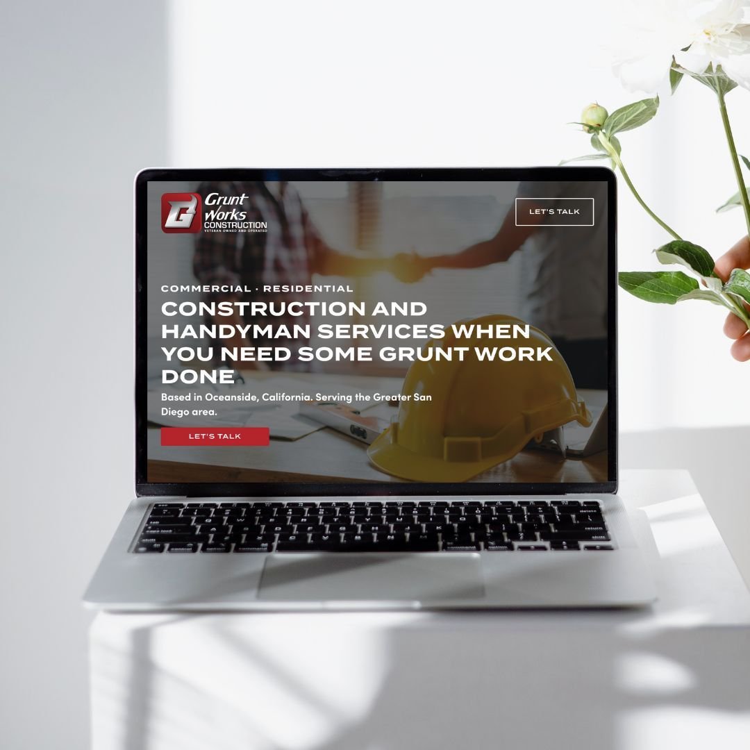
6 Design Tips to Make Your Website Stand Out
A successful website is a balancing act of strategy, copywriting and design.
When it comes to strategy, you want your website to be set up to convert. You want to hold your customer’s hand and guide them through the pages of your website – making it easy for them to find the information they’re looking for and take action when they’re ready. When it comes to the words on your site, you want to speak directly to your customers, show them that you understand their problems, and present your offering as the solution.
We talk a lot about website strategy and copywriting here on our blog. For more on that, here are a few of our most popular posts to peruse:
But today, we’re talking all about design.
Once you’ve nailed down your website strategy and copy, how do you make your website look amazing and stand out online?
6 Ways to Make Your Website More Dynamic
1) A Strong Brand Identity
Cohesive branding is a prerequisite for a stand-out website.
When we talk about branding, we’re talking about your logos, color palette, typography (i.e. fonts ), and other brand elements like icons, textures, patterns, photography style, and more.
Investing in your branding prior to building your website is going to set you up for a dynamic website. A good brand designer will craft your brand identity with your target audience in mind (not just your personal preferences) – choosing visuals, colors, and elements that represent your unique business and resonate with your customers.
2) Beautiful Imagery
The images on your website have the power to make or break your design.
Blurry, dark, or generic-looking images can cause more harm than you may want to believe, and ultimately they can damage your credibility. On the flip side, selecting high-quality photos that match your brand aesthetic can help you build trust with your audience.
How do you get great photos for your website? Hiring a professional brand photographer is ideal, but if that isn’t in the cards right now, you can totally take the photos yourself or use stock images to fill in the gaps.
We’ve actually written a whole blog post on how to choose the best photos for your website, where to find gorgeous stock photos (some resources are even free!), and shots to make sure you get if you’re taking the photos yourself – plus, a few best practices for adding the photos to your website that you’ll want to familiarize yourself with.
Read that blog here: The Ultimate Guide to Choosing Images for Your Website
3) Video Content
There is nothing that adds that WOW-factor to a website quite like video content.
Aside from adding movement and dimension to your website, you can use video to showcase your product or service and help people learn more about what you do.
Here are some ideas for adding video content to your website:
A video header. Those precious few seconds when someone first lands on your website are critical. This is your chance to make the right first impression and hook them right away. A big, beautiful video header is the perfect way to do that. See examples on a couple of websites we’ve designed here and here. Now compare that to a website that has a static image – ya’ll, there’s no comparison.
Banner background videos. These are essentially the same as a video header, but further down the page.
Explainer video. Using video content to tell customers about your brand, product, or service can be extremely impactful. In fact, 73% of customers say watching a video is their favorite way to learn about a product or service, and 88% say they’ve been convinced to make a purchase after watching a video about a product or service. You can see an example of a short explainer video on our website here and another on one of our client’s websites here.
4) Animation and Motion
Adding some animation is a simple way to make your website more dynamic.
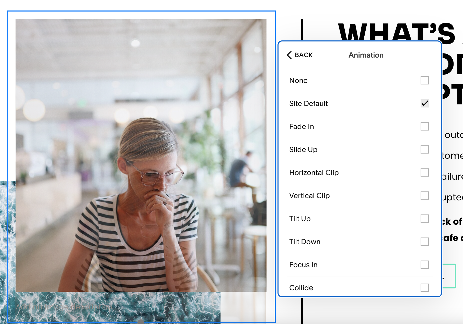
On Squarespace (which we specialize in), you can add sitewide animation with just a few clicks by going to Design > Site Styles > Animations. From there, you can choose your animation style and speed.
You can add animation to a single block (like an image) by clicking on the image, navigating to the Design tab, and clicking on Animation.
If you used Fluid Engine (Squarespace’s new visual builder) to build sections on your website, there are even more customization options. Click on the image, navigate to the Design tab, and hit Image Effect for some awesome ways to add motion effects to your images.
5) An Eye-Catching Testimonial Carousel
Adding testimonials and social proof to your website is more of a strategy component because we know that testimonials from happy customers can dramatically increase your conversion rate. You don’t want your testimonials to get missed and blend in with the rest of your page, though, so it’s important to talk about it from a design perspective.
One great way to do this is to choose beautiful, full-width images as the background of your testimonial carousel to make it stand out.
6) Overlapping Elements
Overlapping elements are a popular way to add some dimension to your website.
You can overlap photos on top of one another, brand elements and symbols on top of photos, photos on top of shapes – the options are endless. See some examples below for how you can overlap content to create a multi-dimensional and high-end look on your website.
A good website is functional, strategic, well-written, beautiful, and dynamic.
Your website is your business’s online home, and it’s often the first interaction someone has with your brand – so making the right first impression is crucial.
You want to make sure your website hooks people in from the very beginning and encourages them to read more about your brand, and the six tips above can help you achieve that.
What are your favorite ways to make a website stand out? Let’s talk about it! 👇🏼
P.S. If you need a website that does all these things, but you don’t want to be the one actually doing said things, we can help. Schedule a Call with us and let’s talk about how we can set your brand up for success online.
More soon,
Mara
WEB DESIGNER + SEO SPECIALIST
P.S.
Subscribe to get our weekly blog with marketing, business, and finance tips dropped straight into your inbox.


